

Data Visualization
Welcome to this page. On this page is the data visualization projects that I worked on at my time at Purdue University. There was two projects, one was made by myself and the other was completed with a team.
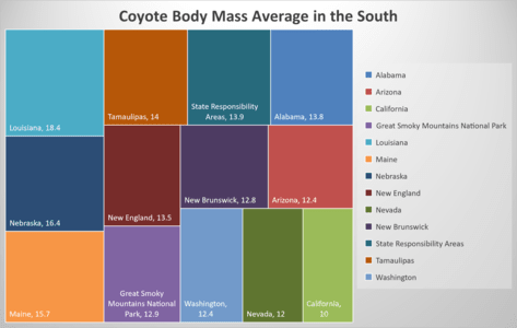
Individual: Coyote Population Mass Average
A coyote is a smallish creature that likes to hunt, but mainly eat the leftovers of another animal. They are not a very picky animal when it comes to food. One of their favorite foods is small animals like bunnies, small foxes, or maybe your pets. There are some cases in which a coyote has attacked a small dog. It is not a very common thing, but it has happened, and this got me thinking.
Could there be a coyote that could take down one of my dogs. I mainly have larger dogs, a Newfoundland and a Yellow Lab, but I also have a Beagle and two cats. My dogs I am not to worried about them getting attacked by a coyote, but I am worried about my cats. One is skinny enough where she could possibly run away, however, there is a fat one as well who only runs when his food is empty. They do have a more likely chance of meeting an end to a coyote, but the original idea was if one of my dogs could be taken out by a coyote. According to Pawlicy Advisor, a full grown Beagle should weigh about 9.1 kg to 13.6 kg. That is not very big, but is not exactly small either. So, I looked at mine, she is a house Beagle. In other words, a Beagle that does not see much of the usual Beagle things, such as hunting or chasing small game. Which has caused her to get slightly over weight in her older years. She is around 10 years old. Youngish, but should be making sure she does not hurt herself. The age and the fact that she does not resemble much of her hunting blood line. She could possibly get killed by a coyote. So, I figure I would get some data on this.
I first acquired the data about coyotes. The website Dryad gave me some data about coyotes in the south-eastern area of the United States. This data is mainly the California area of the US. Even though this is not the area in which I live, it does provide some understanding for the question that I currently trying to answer. I filtered out the areas that did not have any coyote mass information in them and was left with the data shown below. I represented the data in a tree map to show the area that has the largest coyote body mass in kg. As the data and the chart shows the area that has the largest coyote is Louisiana. Which has coyotes averaging 18.4 kg. So, from this I think that my Beagle would take some surious damgage from a coyote from Louisiana, as well as some other areas. But the main area is Louisiana. In other words, my Beagle probably should not go down south to enjoy a low country boil.

Sources:
Team: Data Visualization of Banned Books

This project was a collaborative effort between me and three other people. The teams task was find a topic of debate or other topic that has potential data to visualize. The first thing that the team did was acquire up some data for the topic that we have chosen, which was banned books. The team continued with filtering the data to help answer some questions. Which was, what books are banned or currently in the process of getting banned, who is the person or people trying to ban books, and where are the books being banned. This was all in a hope to try to find a reasoning for such books to be banned. The team find data that gave the states and places that books have been banned in. This help us figure out the where. The next thing was the what, this was also answered by the data. There was a dataset that had book titles and genres. This helped the team figure out what questions that
the team is trying to answer. The final next question was the who?
This question was answered through the same dataset that was used for the where. Since, that set had the authority as well as the type of bans that books have received. Another task that the team had to do was make a visual representation for each member of the team. I decided to try to answer the who, and the what for the data topic that the team had chose. I made a chart that showed the type of bans that a book has received as well as the total number of books that have received those bans. I made this chart to attempt to answer the questions that the team is trying to answer. As for the data visualization process the team started off with the acquire stage by gathering the data for the topic that the team chose. The next stages were the parse stage. In this stage the team put all the data that the team gathered, and put it into the Microsoft Excel software. Through the software the team mined and filtered the data to help answer the questions that the team wanted to answer.
After the data was mined and filtered, the team started to work on their representations. The representations were made by each individual member of the team. Each members representation was made to answer a question. As previously stated the question that I decided to answer was who and what. The chart I made was the types of bans books received. The other thing that I worked on was a video to help introduce the team's project. I made the video to not be a presentation, but instead be a video. A video to help introduce the team's work and findings. Below is the video that I made as well as the chart. This was the work that I complete apart of the project. Below is also a link to the website for the project.
